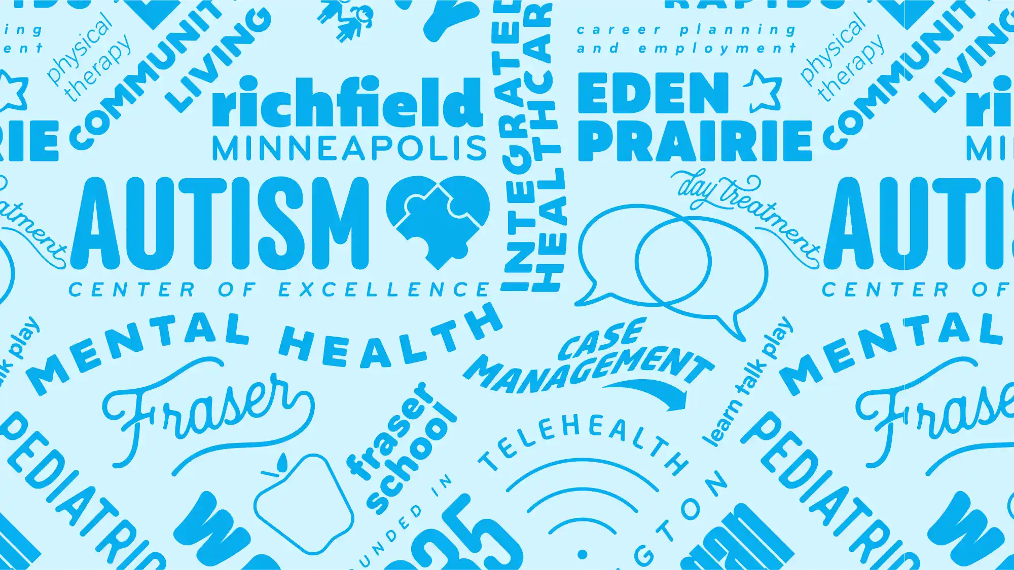
Fraser
For 3 years, I worked as the Creative Director for Fraser, Minnesota’s leader in Autism and Mental Health Services. During that time, I led the redesign of the company website, provided photography, brand development, and all of the internal and external collateral.
Annual Reports and More
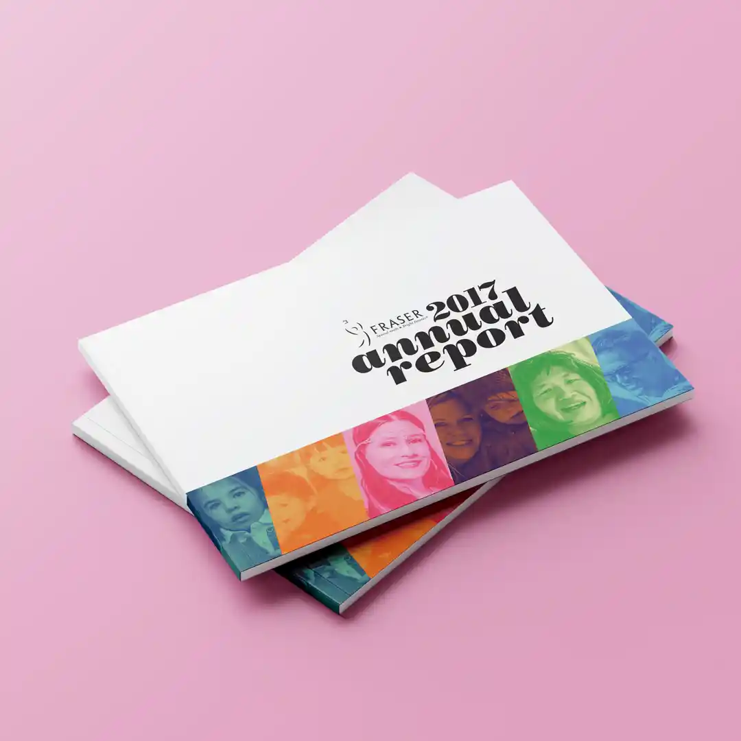
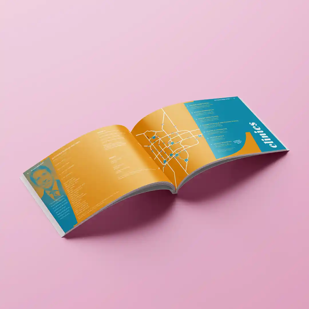
Each year, Fraser releases an annual report which profile various individuals who benefit from their services. I designed and photographed four years of these publications.
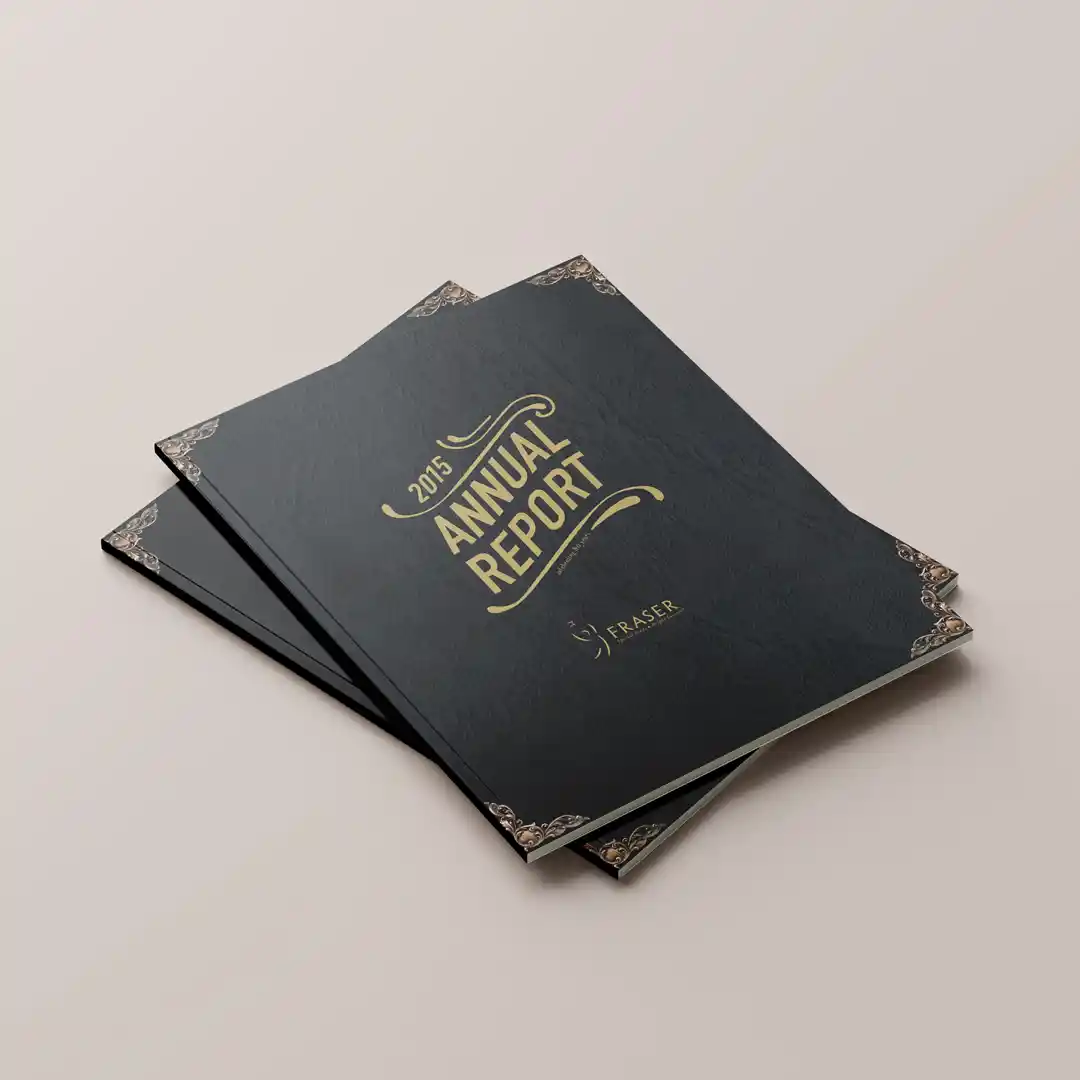
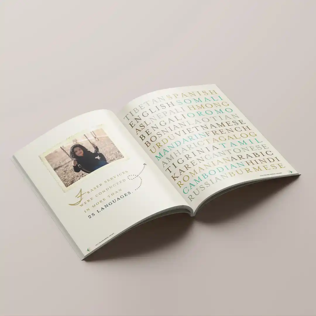
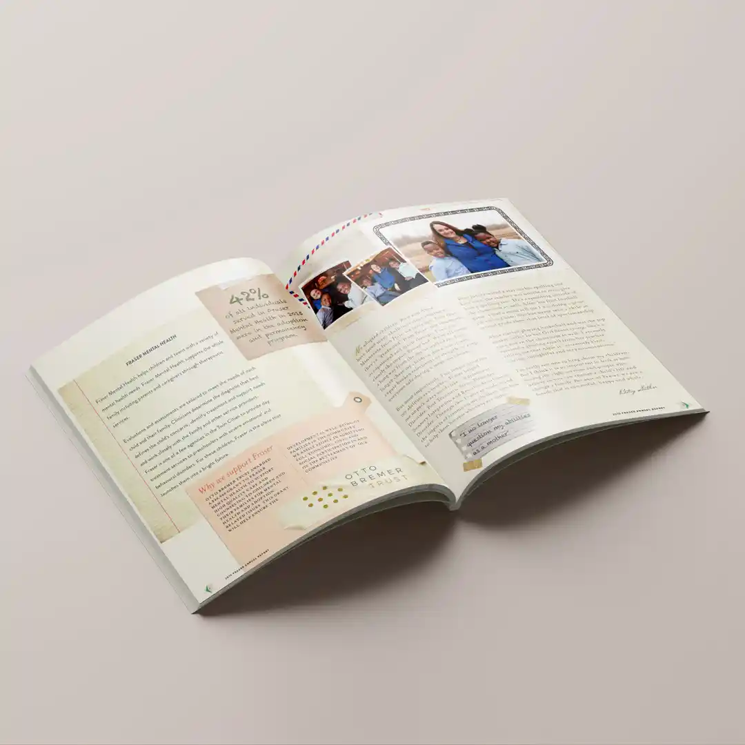
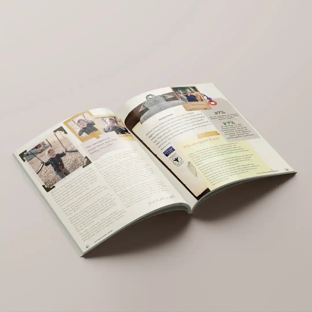
The first in this series celebrated their 80th anniversary. For the creative direction, I went with a scrapbook theme. Every single piece of nostalgic paper, photo corner, and recipe card was procured at a local antique shop and photographed by me–truly a labor of love.
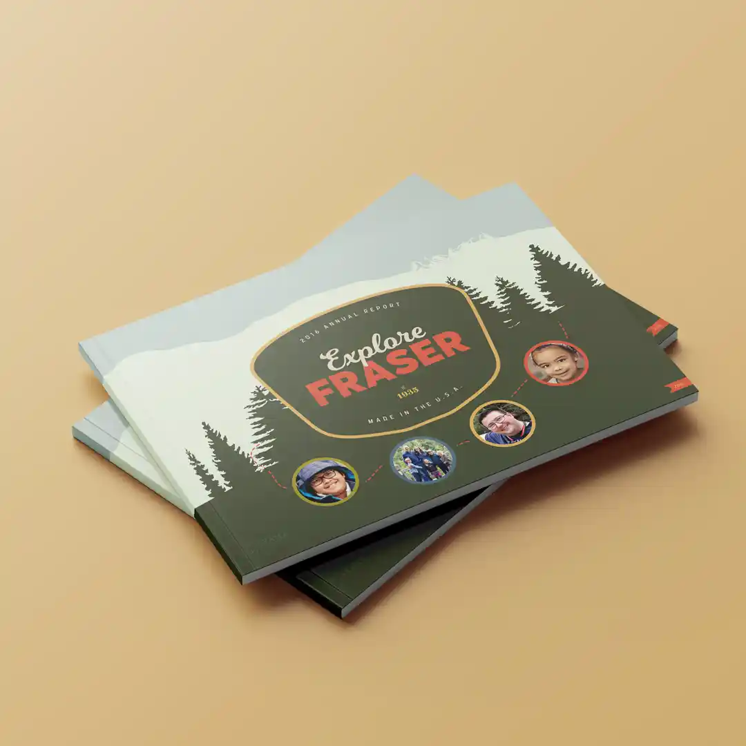
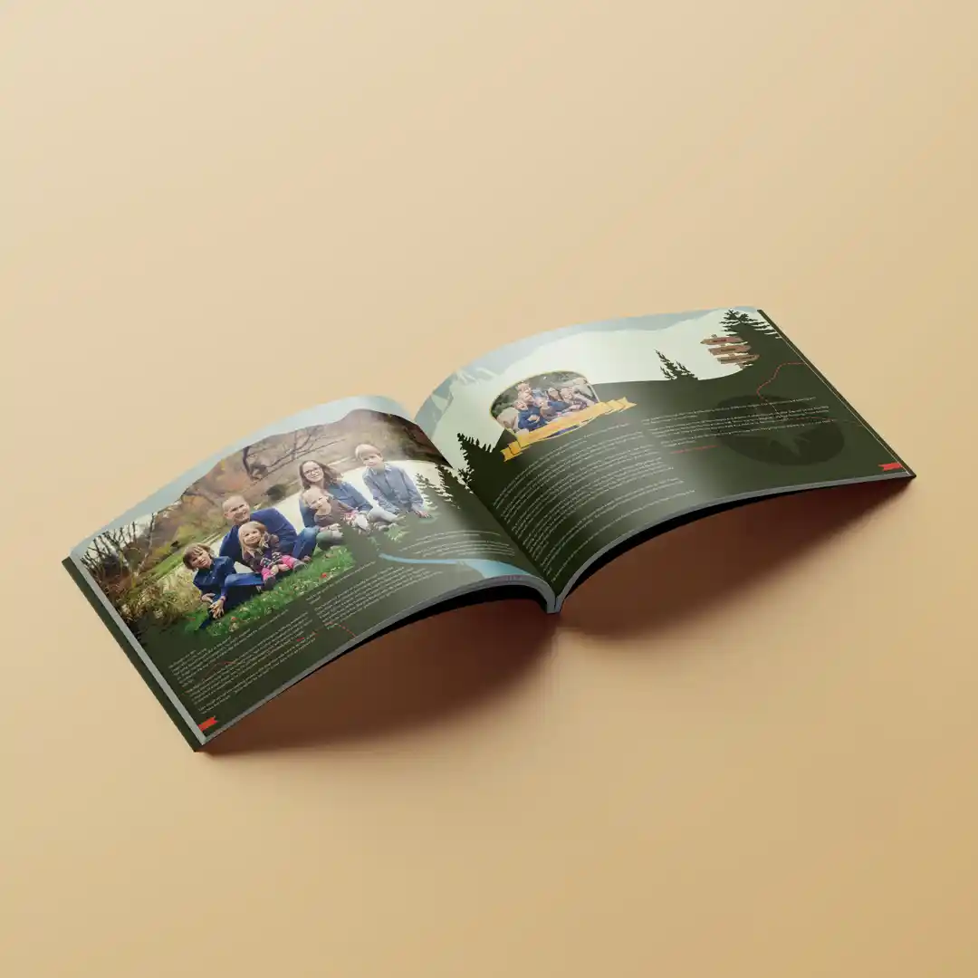
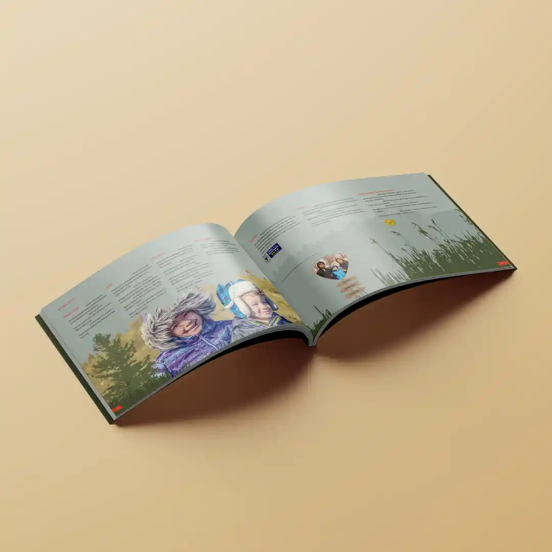
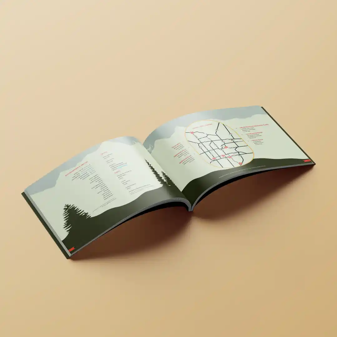
For my second year, I took the approach of a retro travel guide. As you flip through the book, the elevation gradually increases to the sky, which features the donors. There is also an easter egg (a squirrel) hidden on every spread but one.
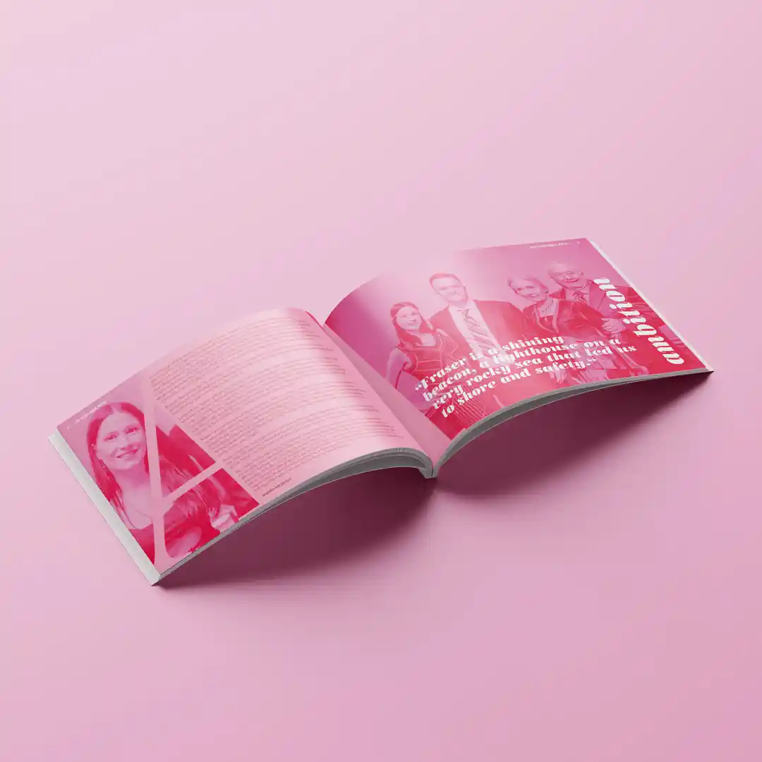

The third year of this project turned to bold color and typography to define each profile and section. Each spread was made of a single letter that acted both as a window frame for the photography and as a background for copy. The letter was also an abbreviation for a word that encapsulated the story.
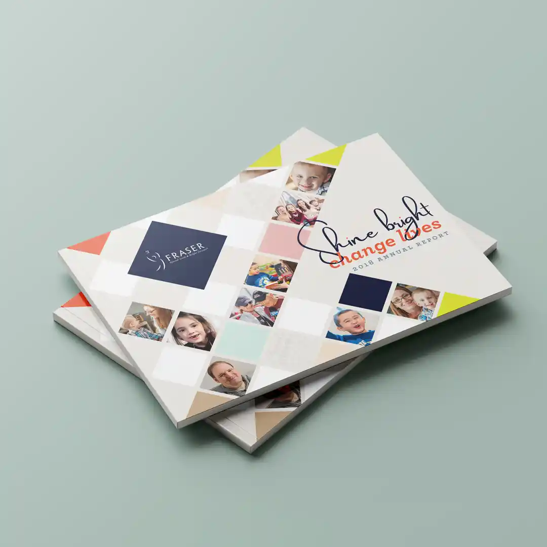
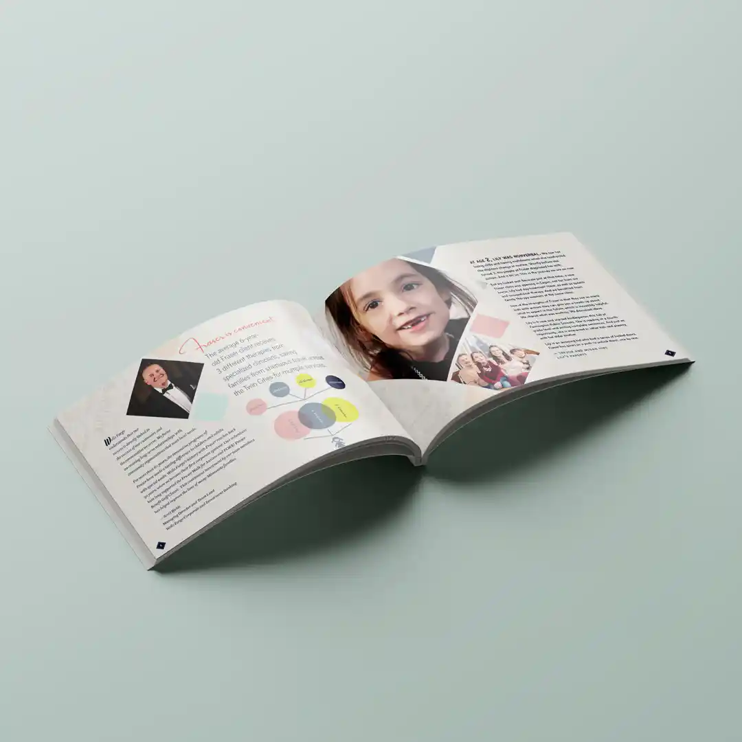
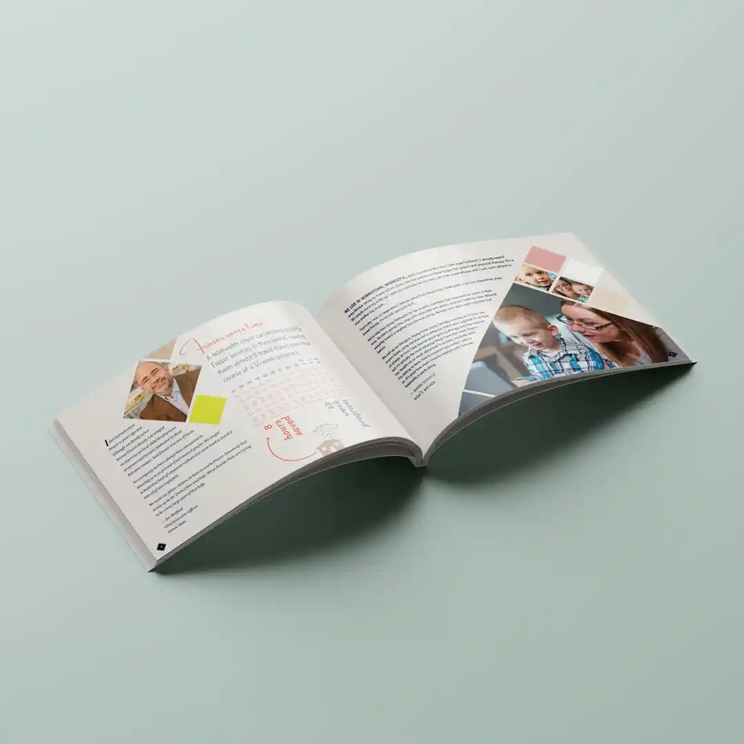
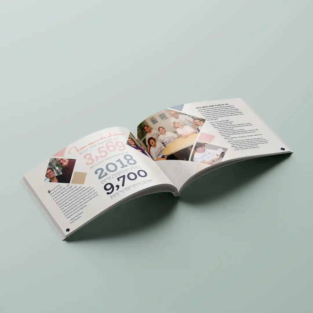
The fourth iteration of this was inspired by the Rhianna song, Diamonds. I chose to make each family profiled shine bright like a diamond. To drive the point home, each diamond shape that featured photography was spot coated with a gloss coating to make it "shine," while the rest of the publication was in a matte finish.
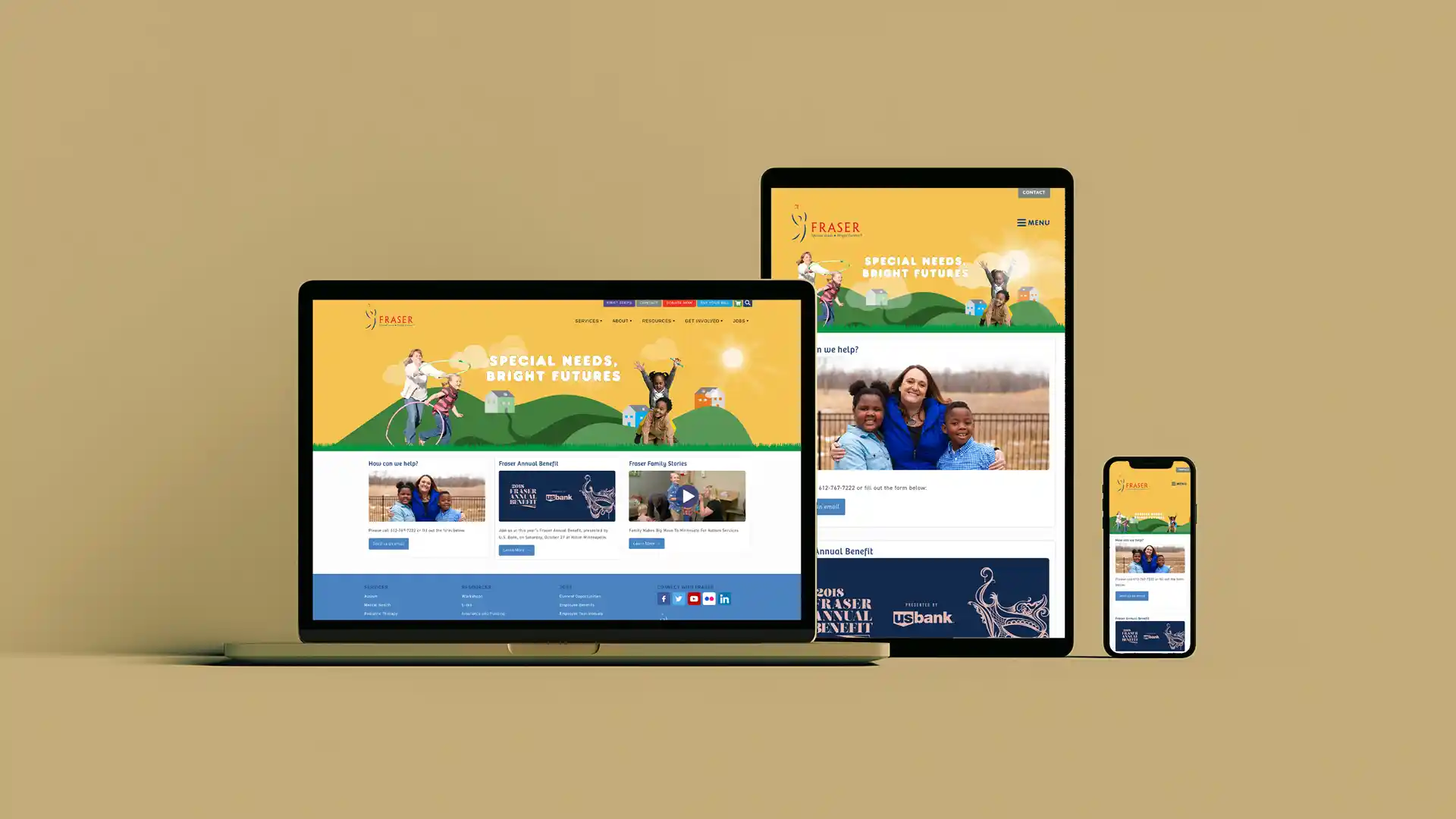
I built Fraser a mobile-friendly website that communicated their vast service offerings, had interactive video galleries, a rich e-commerce system that featured a robust event system, and a client payment portal.
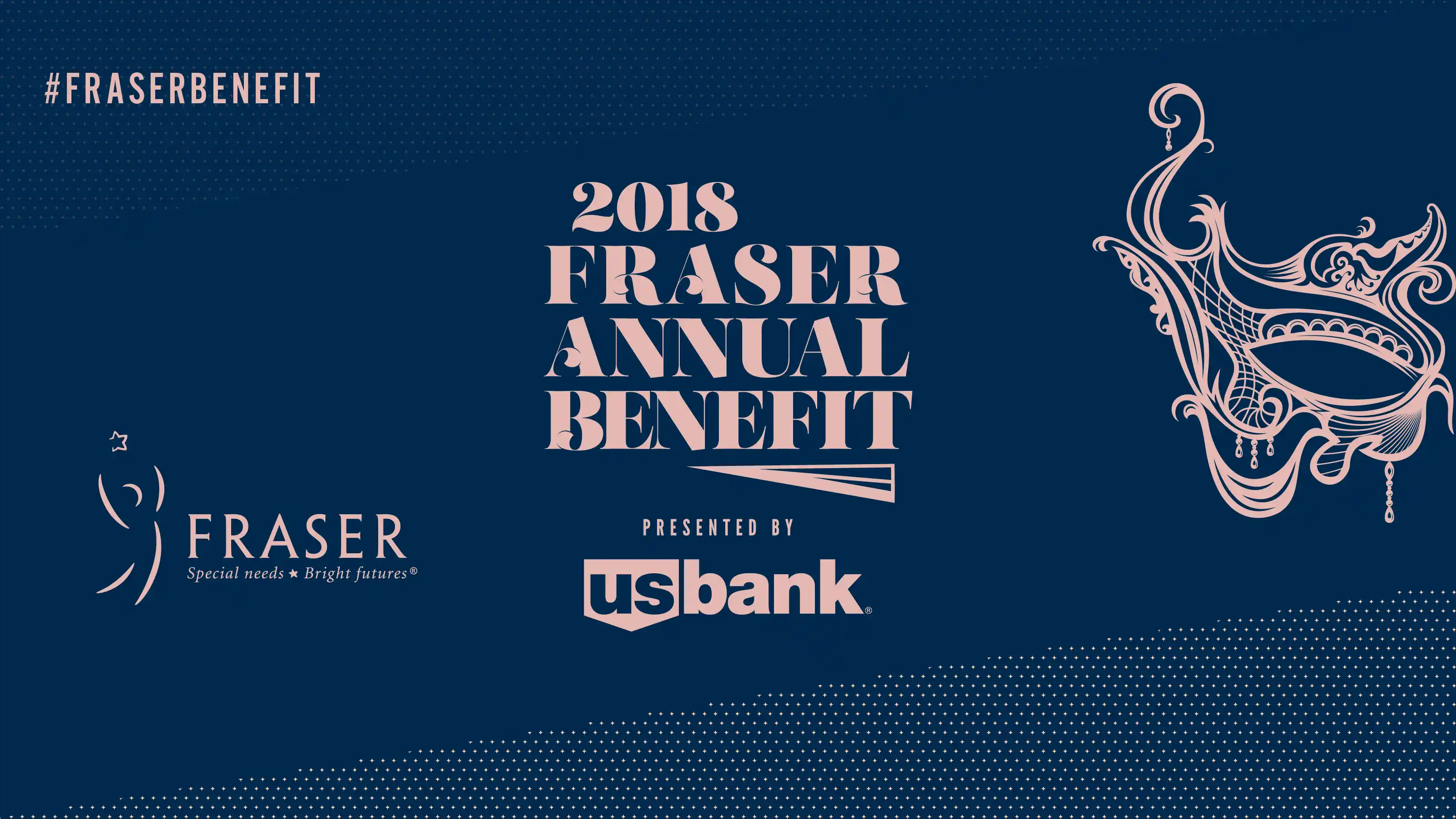
Design for one of Fraser's Annual Benefit Galas. The entire event was mask-themed.

Design for one of Fraser's Annual Benefit Galas. The theme was "roaring 20s."
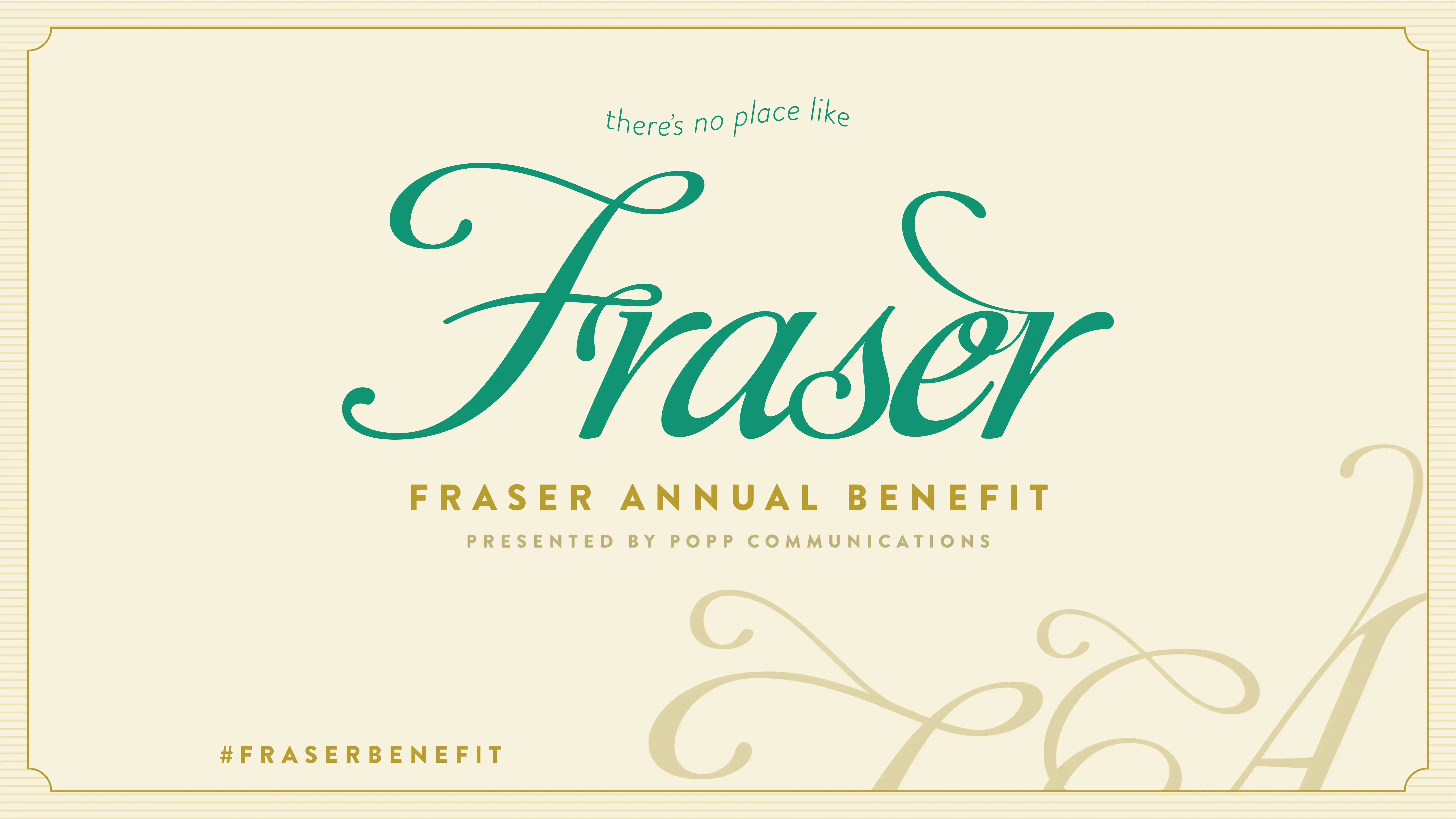
Design for one of Fraser's Annual Benefit Galas. The event was themed after the Wizard of Oz.
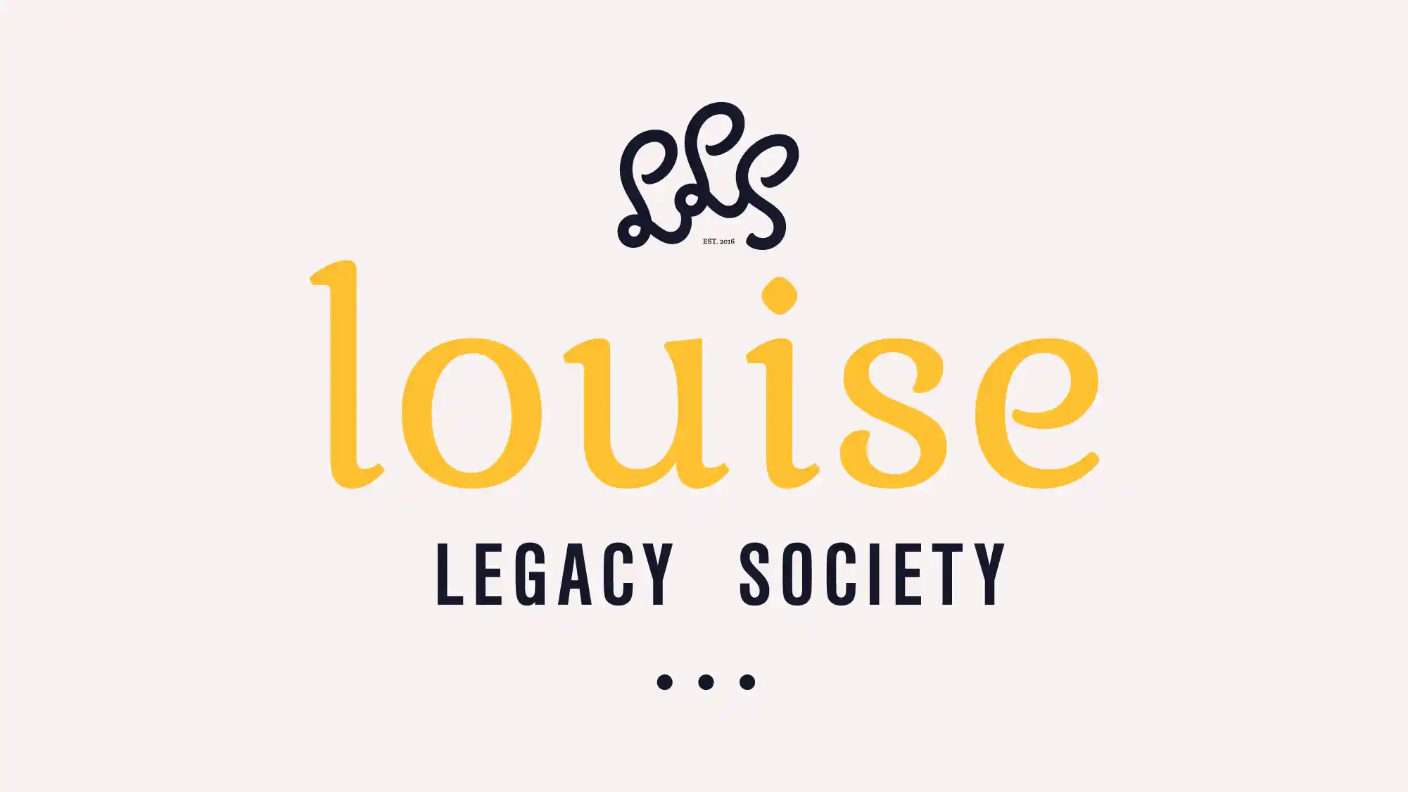
Named after Louise Fraser, I created this logo to honor the elite donor circle for the development team.
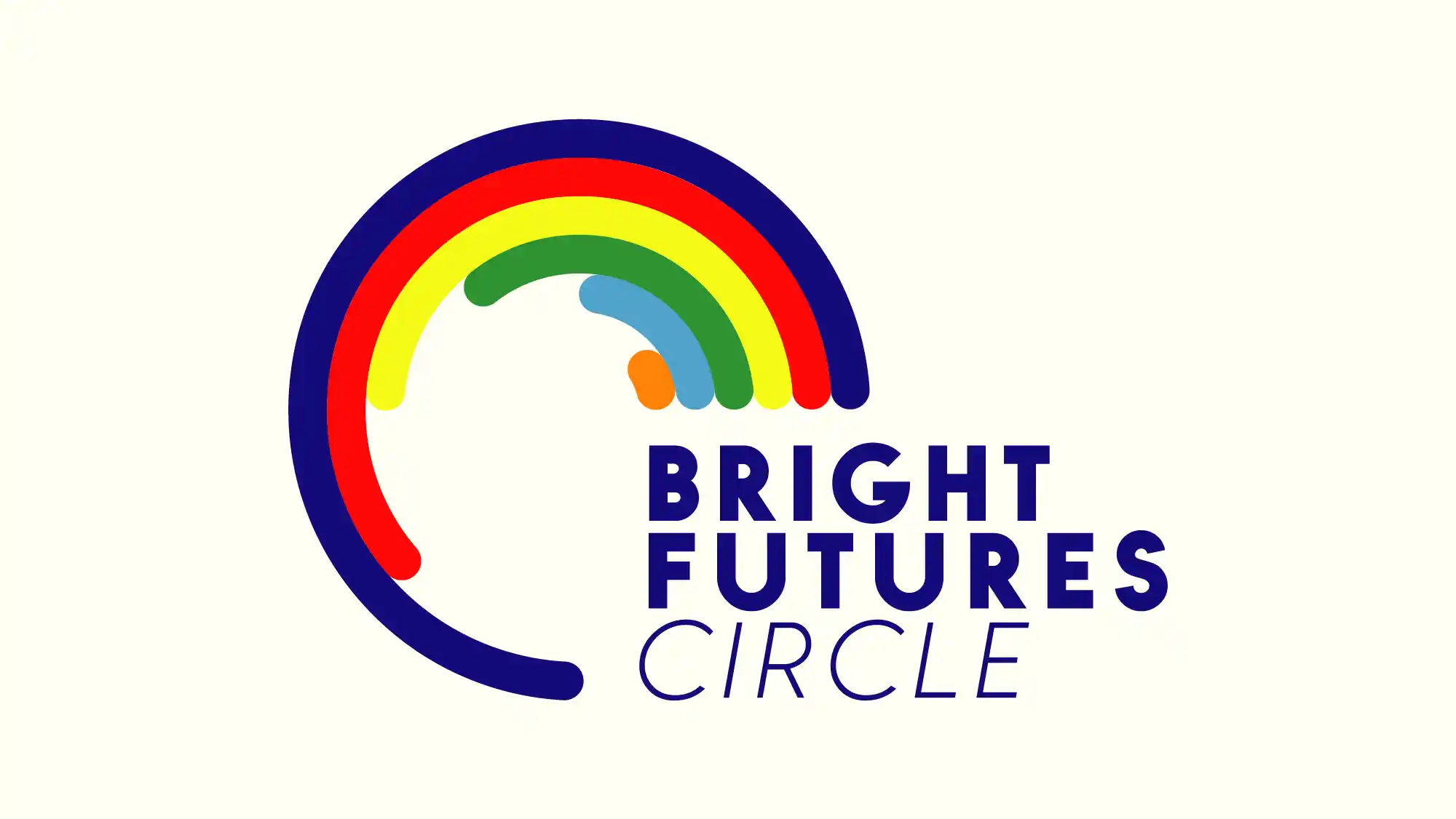
Bright Futures Circle was Fraser's donor-level system. I created this mark to illustrate the various levels, illustrated by the various colored circles. It honors the inclusive nature of Fraser's work and the diversity in their donor base.
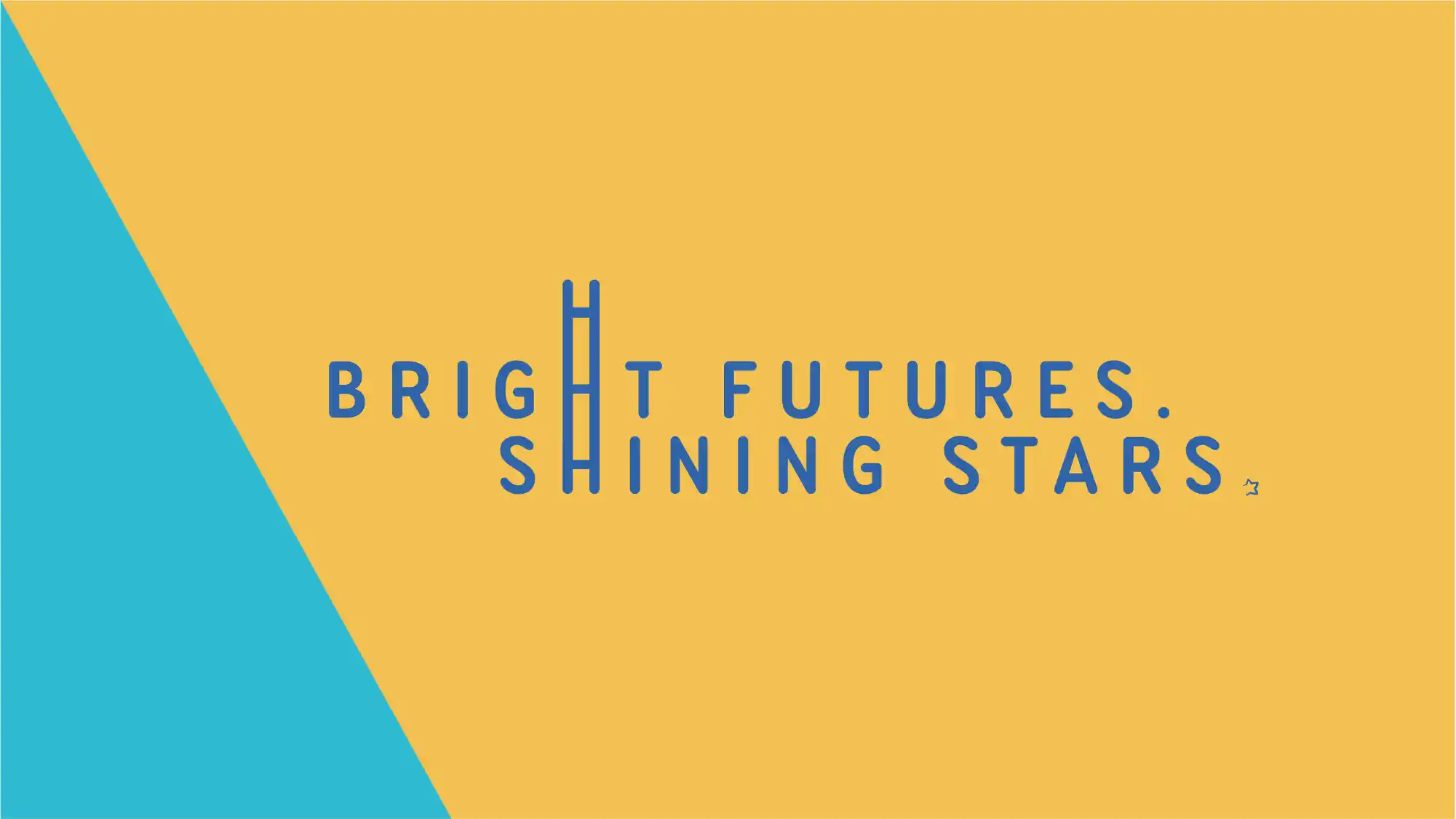
Created as a campaign for the HR department, this mark spearheaded a recruiting campaign focused on attracting new employees.
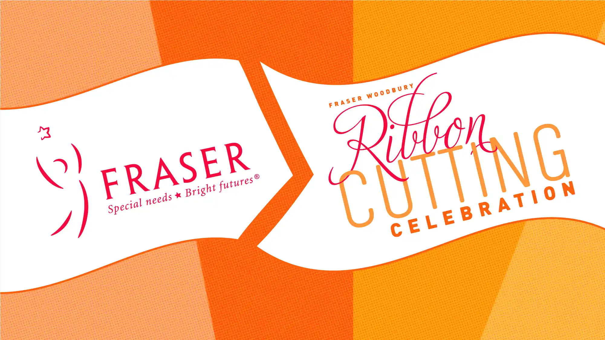
To announce the opening of the Woodbury location, I made this interactive ribbon cutting ceremony invitation.
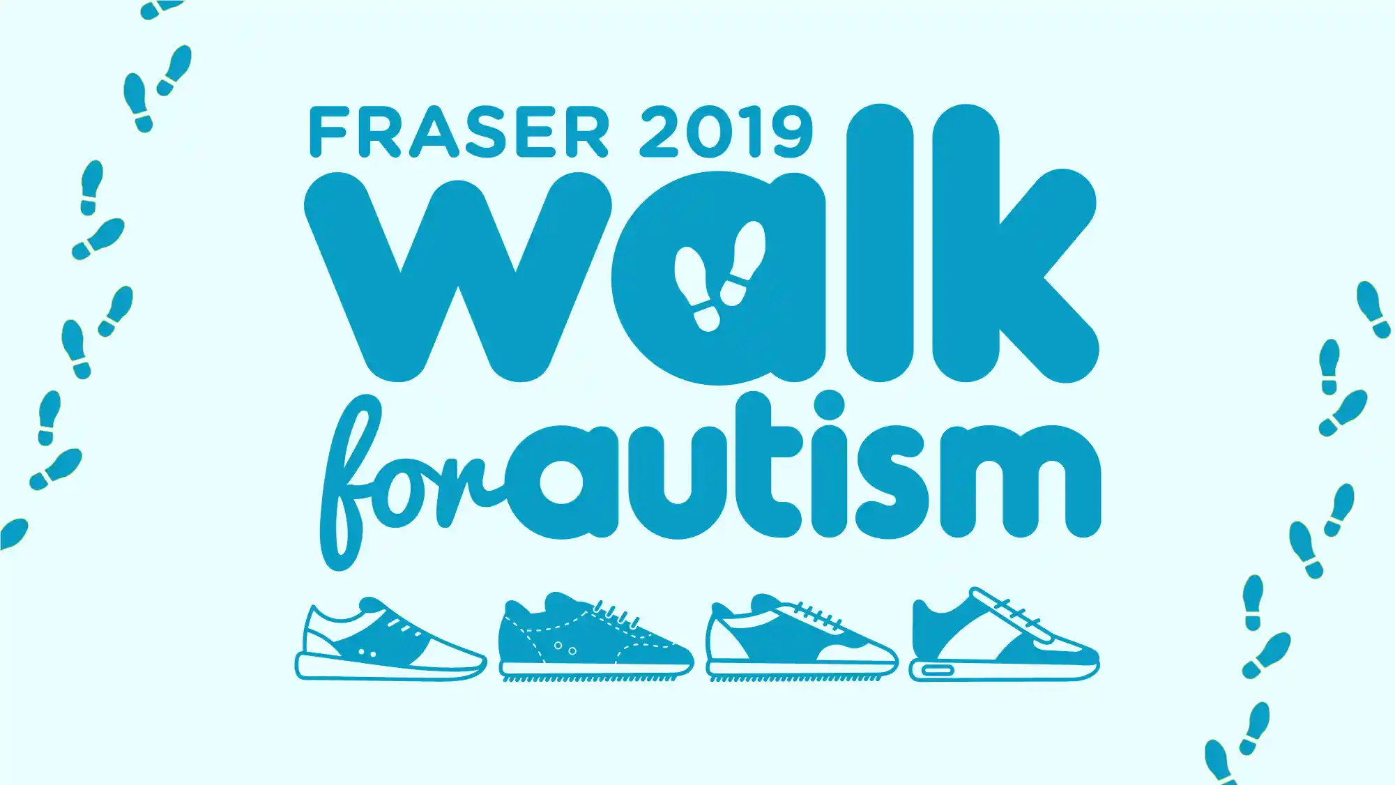
Every spring, Fraser hosts their Walk for Autism at the Mall of America. I created this mark to support marketing efforts related to the event.
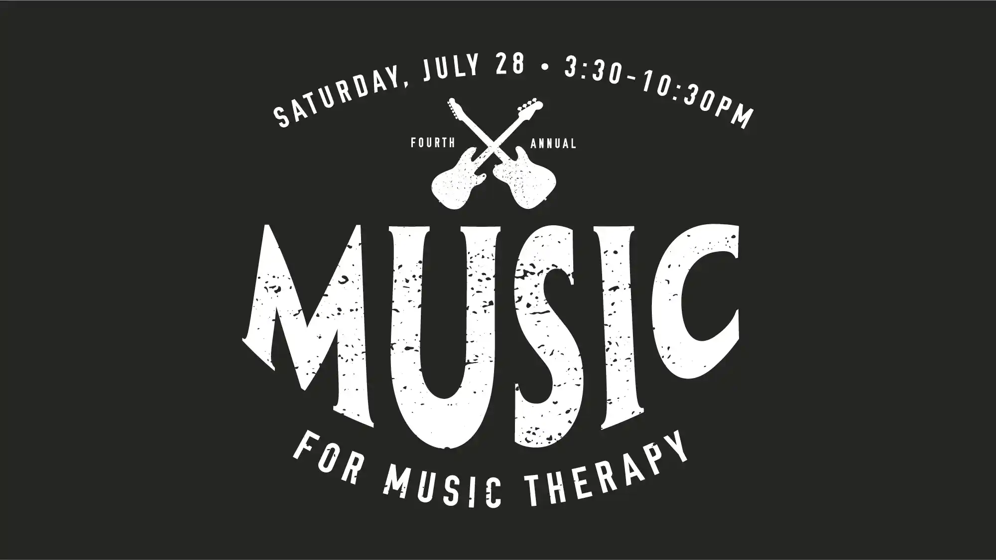
A fun logo to promote a music-themed fundraising event benefitting the music therapy program at Fraser.
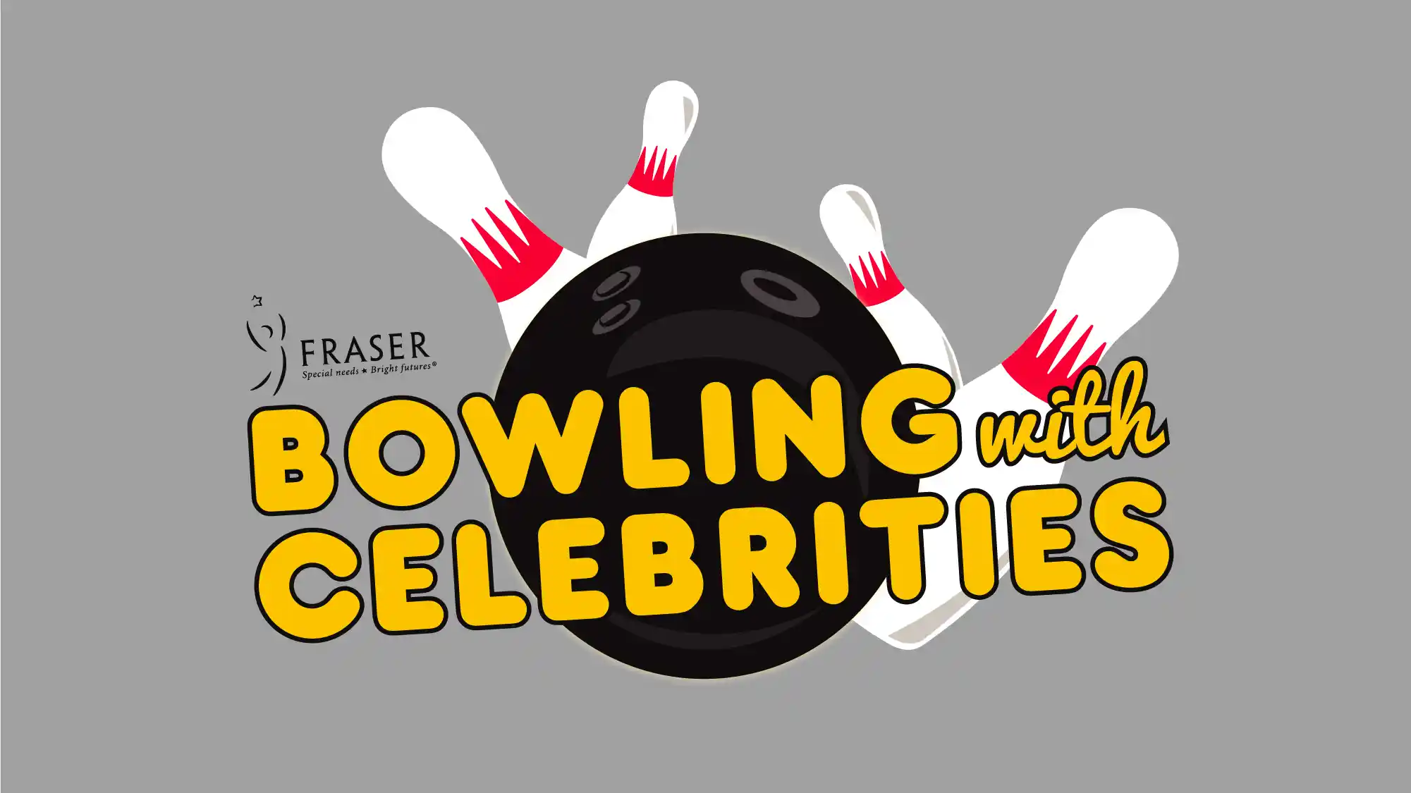
A fun logo that was used for a fundraising event where local celebrities would bowl alongside the Fraser donor community.
Let’s Make Something That Amplifies Your Vision.
I work with a limited number of clients each season to give each one thoughtful, concierge-level attention. If you’re ready to refine your presence and move with clarity, let’s talk.
